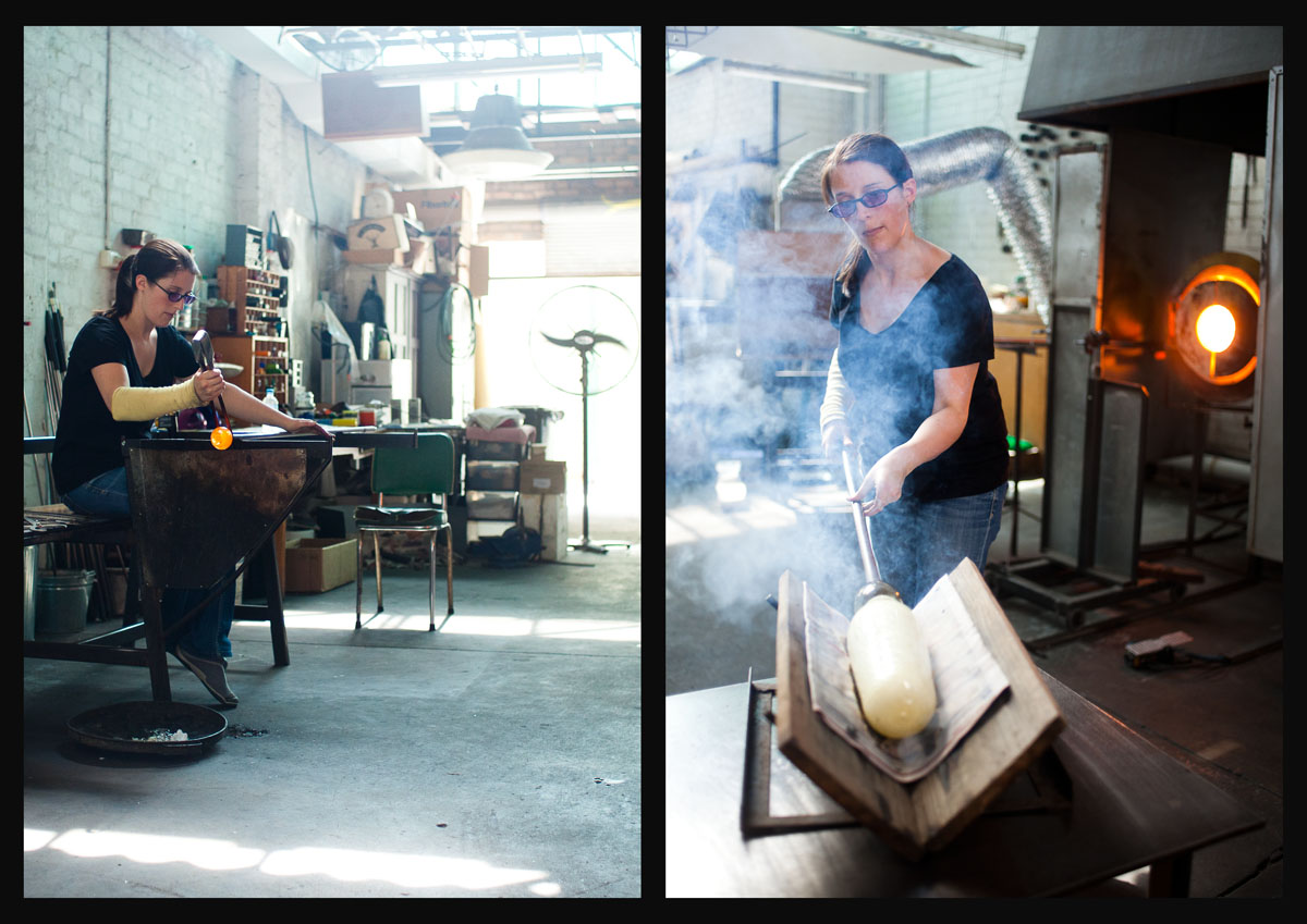
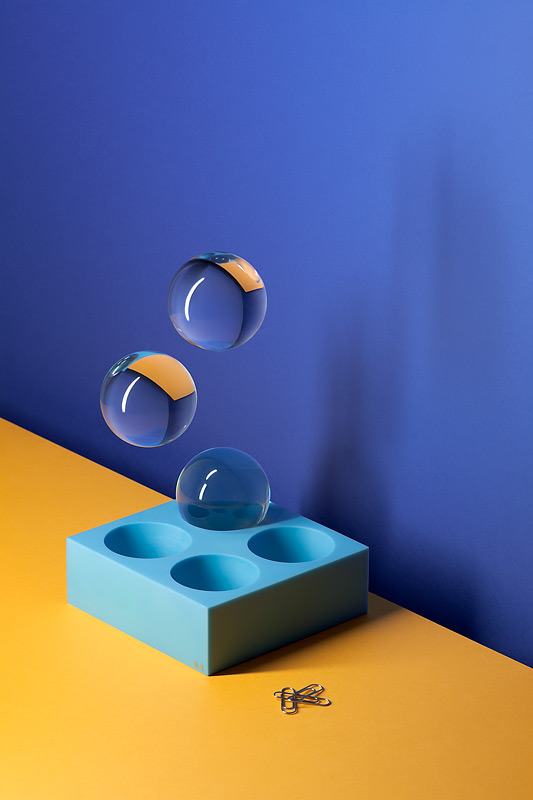
New work – Glass blowing studio

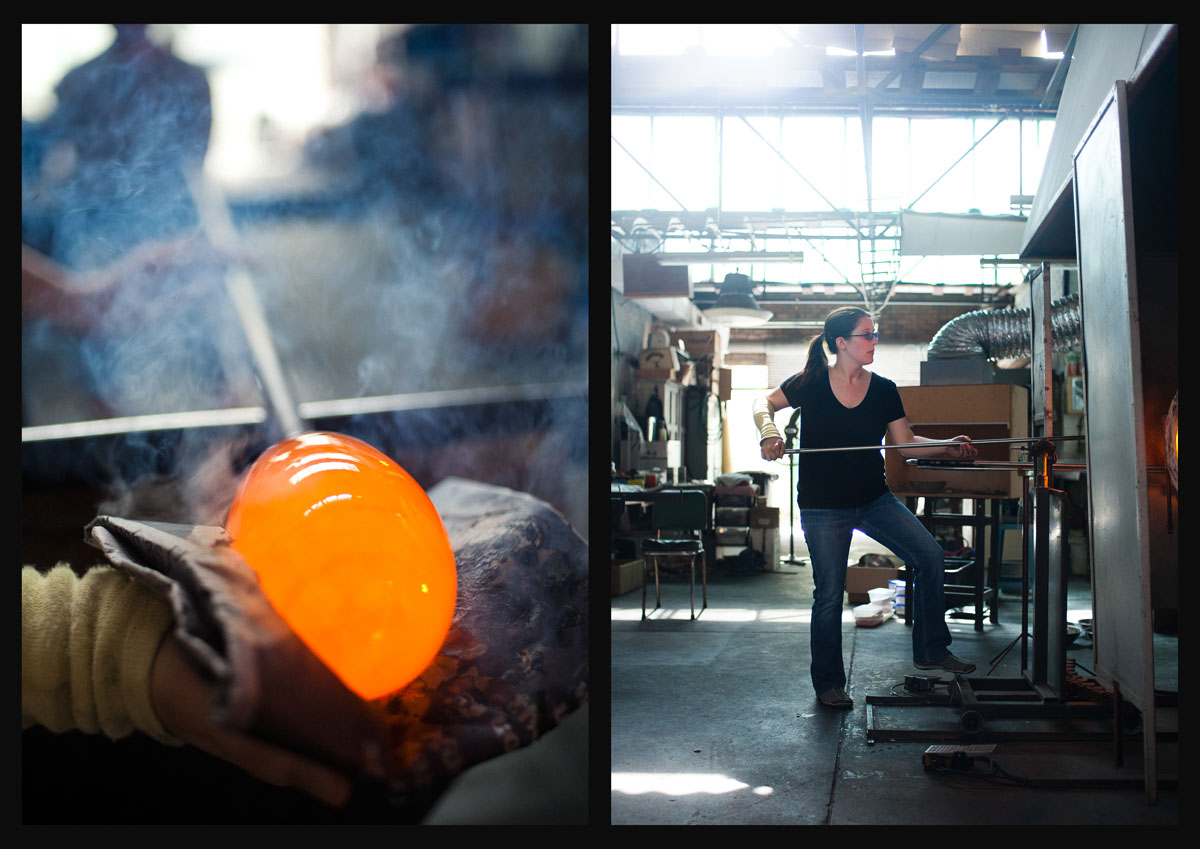
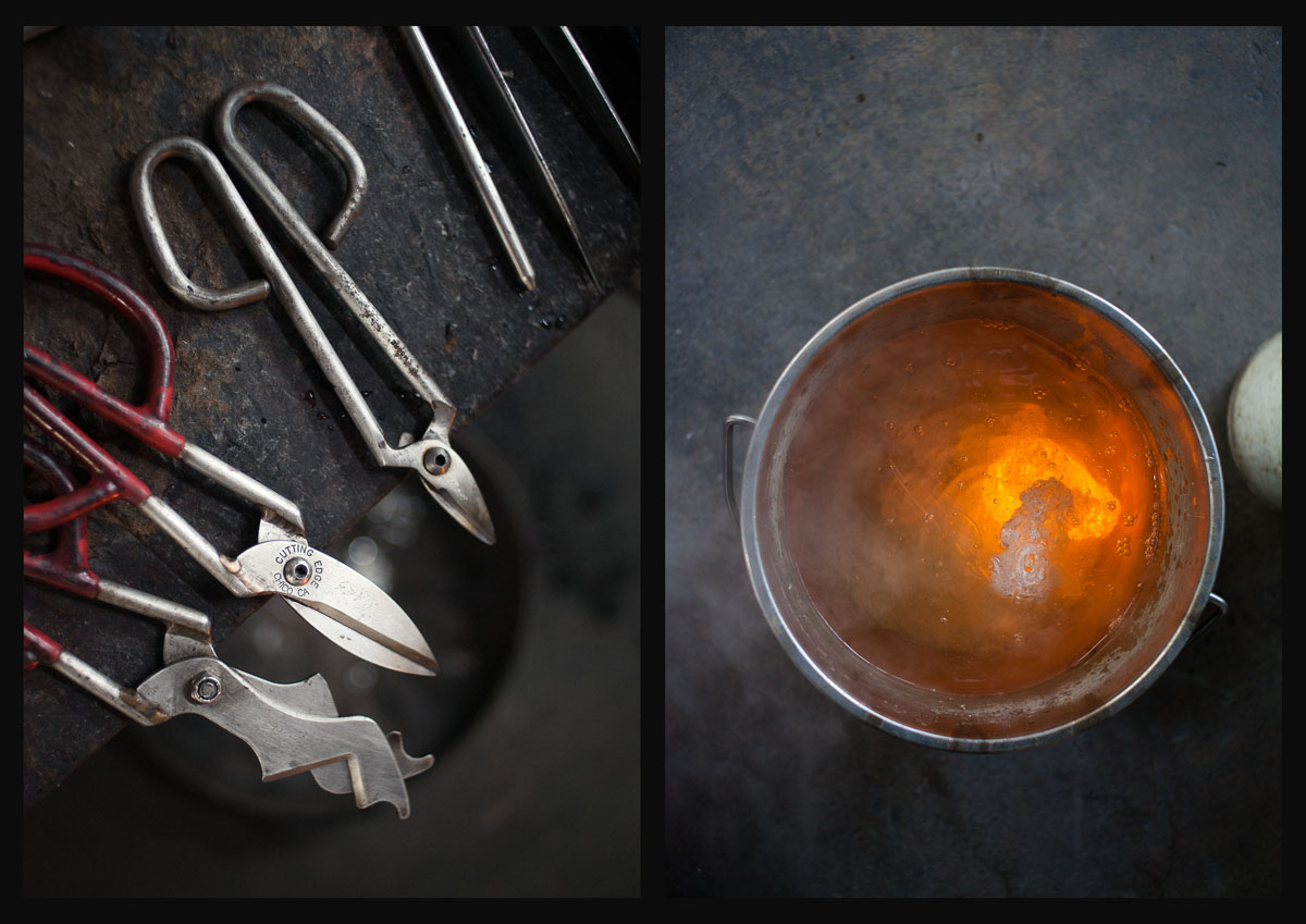
Some stills from the studio of Mariella mcKinley as she produced some of her wonderful work.

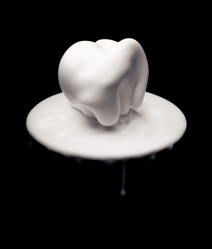
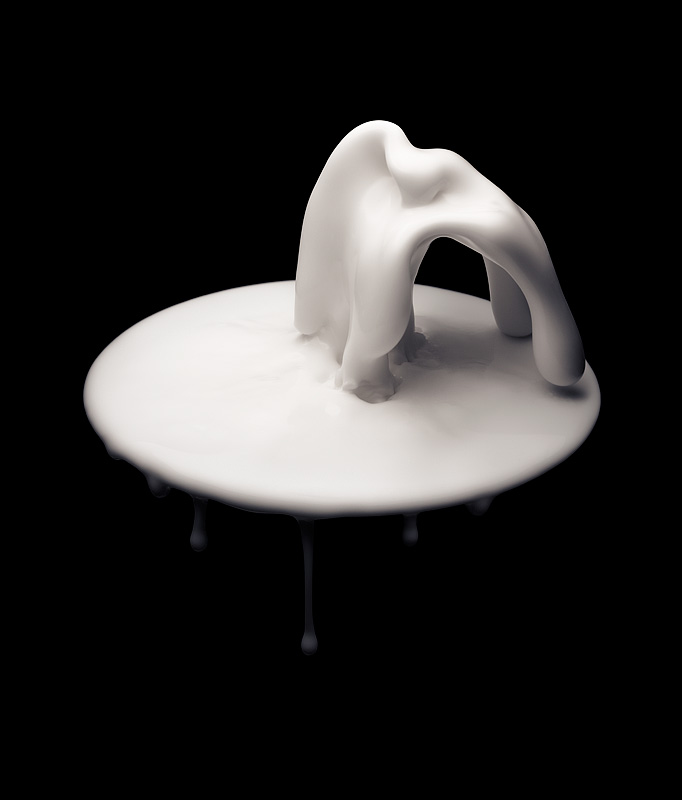
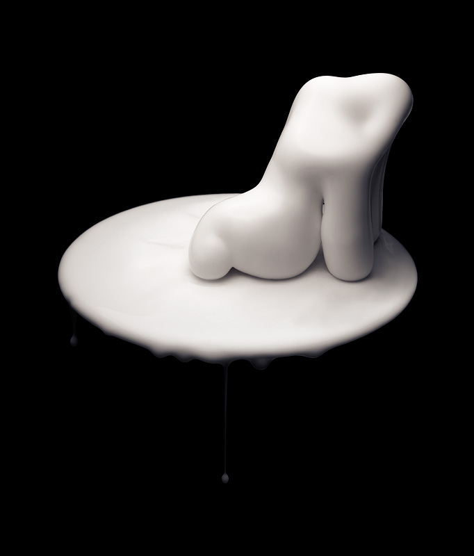
New work – Fluid dynamics

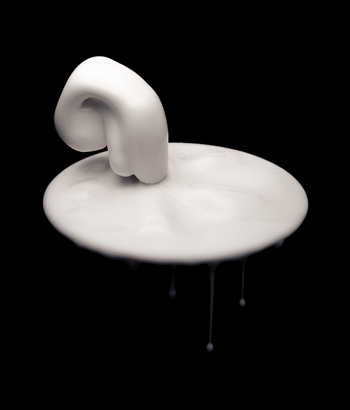
These little creatures are my latest personal series. They aren’t quite sure of their place in the world yet, but they’re on their way to find out!

No CGI here – these photos were made with a sine wave generator, an audio amplifier, a speaker and a solution of cornstarch and water.

Cornstarch and water or “Oobleck” is an example of a Non-Newtonian fluid – A liquid that starts to behave like a solid when under stress, in this case a mechanical vibration caused by the speaker cone moving up and down forty times a second.

Here’s a quick bit of video I grabbed of the Oobleck in action, apologies for the substandard production values – this is a test for a more elaborate video project that is in pre-production at the moment.

Another messy but very fun shoot. I love nothing more than geeking out in the studio capturing some amazing visual phenomena!

New work – Daniel Emma

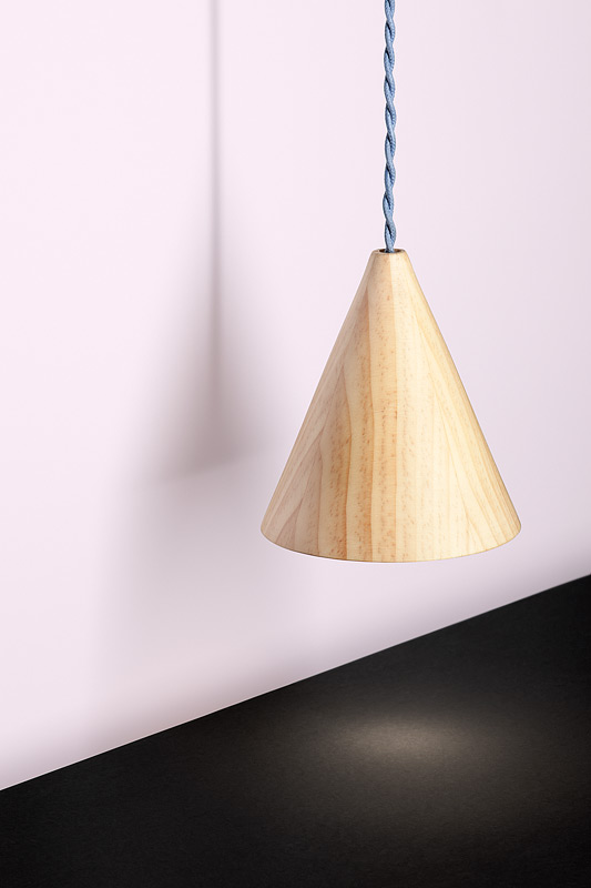
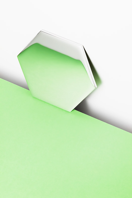
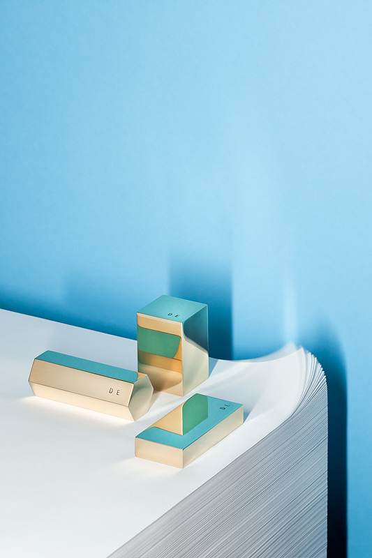
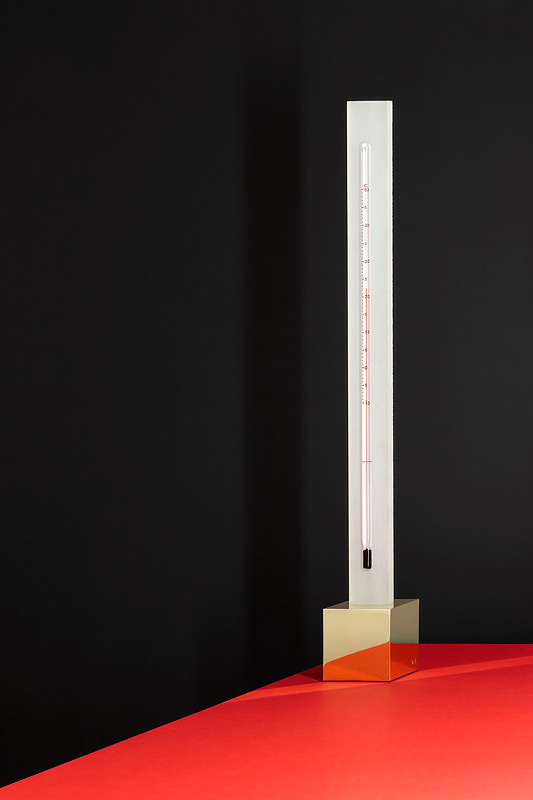
Just finished up a nice little series with the aid of product designers Daniel Emma, whose boundless excellence can be seen gently emanating from their beautiful old house near Port Adelaide, and thus far has made it’s way as far as London, Tokyo and New York. They recently picked up the 2010 Bombay Sapphire Design Discovery award – Hurrah!
Amanda King – Glass artist

One of the great things about my job is that from week to week, I get to work with some astoundingly talented people. One such person, Amanda King, recently asked me to help document some of her work for an award submission.

I didn’t really know what to expect when I arrived, so you can imagine my delight when I saw this piece, perfectly situated on a wall in her studio:
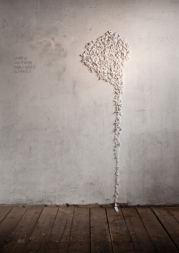
How easy can my life get! Point camera, set up lights, press buttons, look official, click. Job done.

Of course in reality nothing is ever that simple, but the joy of working with artists like Amanda is that the result becomes a real collaborative effort, and I get a huge thrill from seeing that together, with what I can bring to the task at hand we are able to do justice to that original spectacular vision.

Capturing Coffee

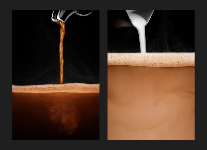
I love coffee. Can’t get enough of the stuff. I realised though, one day over my obligatory morning cup, that I had never really given it the attention it deserved, photographically speaking- espresso really is a spectacularly odd liquid, and the way it looks, changes and moves is marvelous when examined closely.

I set about planning a series of images that show the process from the bean to the cup, in pairs of light and dark images. I used my home espresso machine for the project as I know it well (although it has a few drawbacks as well – it’s a home machine after all) and set up in the studio with a light source capable of firing fast enough to stop the liquids in motion.

One of the challenges was finding a container to photograph the liquids in, I ended up building a very small aquarium out of optical glass flats, just big enough to hold a few shots of espresso. This worked brilliantly, but the temperature of the liquids meant there was of course quite a bit of condensation and steam to deal with in post production – a necessary evil, sadly.

It was alot of work, but I’m super pleased with the result.

I plan on adding some beautiful natural light shots of simple brewing equipment, along with a high-speed video sequence of espresso extraction when an opportunity arises to work with the right camera.
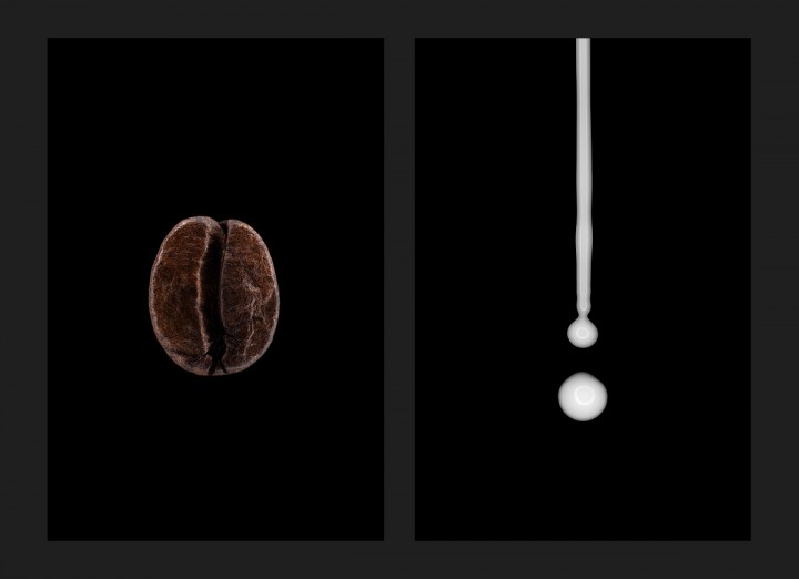
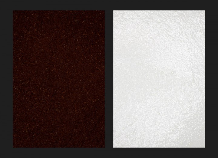
Coffee bean and milk

Ground coffee and steamed milk

Espresso and Cafe Latte being poured

New promo image – Brilliance

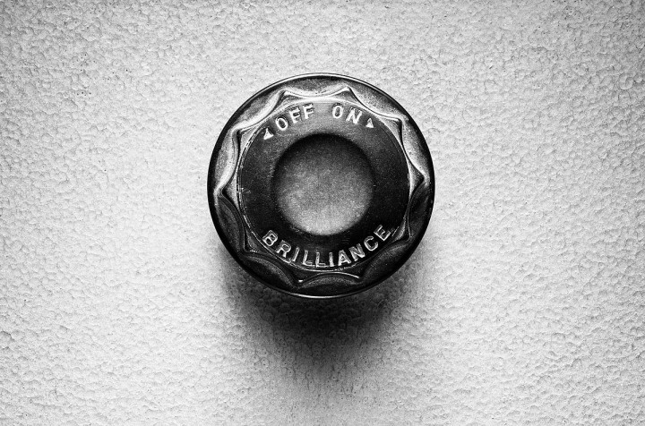
Brilliance switch

Start of a new series methinks, and it’s going on my new cards!

Now to find some more silly switches and dials…. any suggestions?

Folio foibles

For the last few weeks I’ve been in printing mode. After a bit of a run working on new images, the time felt right to re-do that holiest of holies to the commercial photographer, the book!

I’ll go into more detail about the book itself in a forthcoming post, but I just wanted to relay some experiences on the trials and tribulations of being a control freak when it comes to printing.

I’ve always taken an interest in printing my own work, and luckily for me I started shooting right about the time when inkjet printing was a more-or-less mature technology. Printing is an art unto itself, and I’ve often wondered whether it’s a good use of my time to spend hours and hours on getting the best possible output from my Epson. At the end of the day though, I’ve found if you want the quality, you have to put in the time.

Print quality with inkjet prints is generally a 50/50 split between the properties of the paper surface and the properties of the inks in the printer. Some practical considerations – the paper I chose had to have a good weight, given that the pages were being bound straight in to the spine, and the surface had to be durable enough to survive handling the book. Then of course the paper had to have the right look- do the images jump off the page?

I started out the process by looking at the current crop of paper as new ones come along fairly regularly, and after testing a dozen or so, narrowed down to two or three final contenders. The final group were all from a relatively recent development in the inkjet world which is the use of ‘baryta‘,  a white pigment that was very common in the days of fibre base darkroom papers but has recently found it’s way into digital inkjet papers as well. Generally speaking, baryta papers have very similar look and feel to traditional darkroom prints, with a glossy or lustrous surface, deep rich blacks and a bright white base.

In the end, I narrowed it down to a Hahnemuehle paper- Fine Art Baryta. This paper had the combination of a heavy weight, a pure white surface with the right level of shine, lustrous without being super glossy, and a fantastic black depth and saturation perfect for commercial work. Excellent!

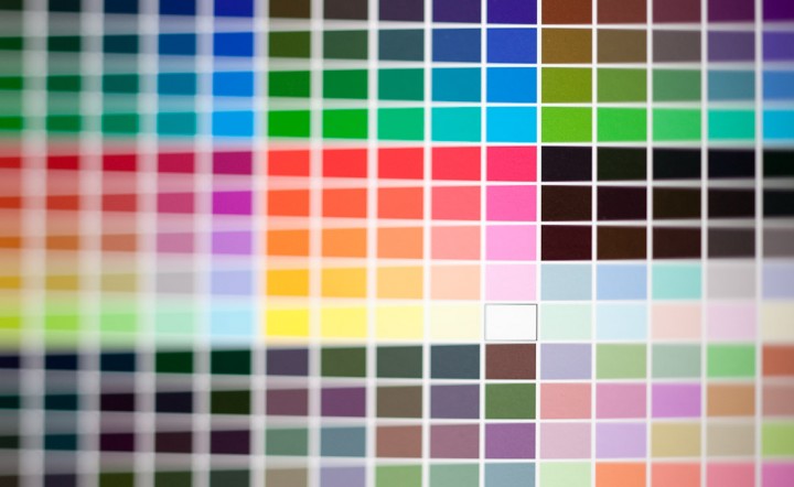
So off I went, I bought the paper and set about profiling it to my printer, which is the process of printing out test charts of colour boxes, measuring the colour with a spectrocolorimeter (coolest word ever?) and letting some clever software crunch the numbers to build a profile of how the ink reacts to the paper surface.

All was going well until I began printing out images- I started seeing some faint but very noticeable imperfections in the surface of the paper – almost like scratch marks in the coating, which were, annoyingly, completely random. I spent a while narrowing down what exactly was going on and getting to the point where I knew it was nothing to do with the printer, and then back I went with the paper to my supplier. We both ummed and aahed for a while, and decided we should try a different batch of paper. After tracking down a different batch at a different supplier, I got back and rather gingerly sent through a print. Same problem. Dang. There goes that paper! Completely unusable. Weirdly enough, no one else had ever had problems with that stock, and it was particular to the A3 cut sheet size I was using, I never saw it in my A4 tests.

Having my favourite stock turn out to be unusable was pretty annoying, as there was no other paper that had the exact character I was after, and that was available in the size I needed. In the end though things turned out rather well,  as I found another Hahnemuehle stock that turned out to be pretty close to perfect, and had a few advantages as well. The thing about Hahnemuehle is that their stock, for my tastes, has the right feel in the hand. There are brigher, smoother and more saturated papers out there but they invariably end up being too plastic and inorganic for a book.

The paper I’ve ended up printing with is Hahnemuehle Photo Rag Baryta, which is a glossier, warmer version of the classic Photo Rag surface which used to be my favourite for matte fine art prints and is still the most widely used for fine art inkjet printing. The extra warmth of Photo Rag Baryta actually turned out to be a plus – the white point almost exactly matches the linen in the spine of the book – Win!

So in the end, a paper that I had written off earlier actually was the best choice, all things considered. Even if I could have used Fine Art Baryta, the warmth of Photo Rag Baryta has won me over, and my images are sitting very nicely. It has slightly less contrast because of the warmer white point, but the surface also has less texture which is a bonus.

I’m still waiting for the official word from Hahnemuehle about whether they consider the two boxes of paper I sent back to be defective, and I’ll have to reconsider my position on them if they think the problems in the surface are acceptable. I know paper making is a tricky process and the odd imperfection is a risk you take, but for entire boxes to be unusable is not a good reflection on their quality control.

New work – Liquid petals

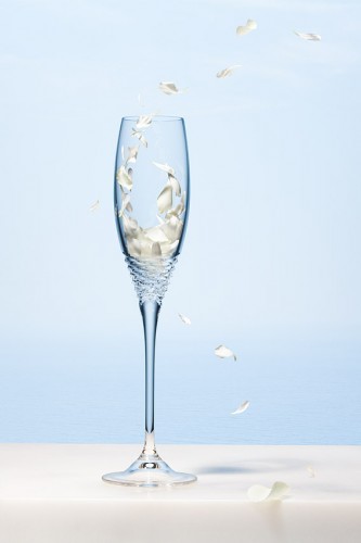
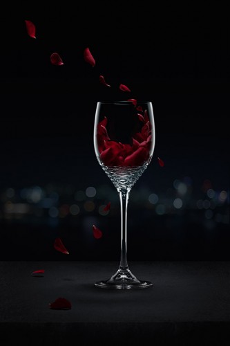
So here’s the fruits of last week’s labours: a pair of images featuring a line of crystal glassware.

The basic premise was to to create a feeling of a breezy summer day by the sea for the champagne flute, and a warm evening on a city terrace for the red wine glass. I was thinking of adding a liquid splash, but give it a bit of a twist by creating that motion and splash using flower petals.

I knew it was possible with some careful planning and some clever post work, so I set about shooting the static glass, and then gradually adding petals in motion which were frozen in flight with a Broncolor pack set to a short flash duration.

Careful blending of a few base exposures in post gave me a starting point for the liquid, and then around 30 petals were masked in for each image to create the shape of the pour.

I think the result links in well with the original concept of a summer’s day and evening by the sea, and the petals nicely suggest the motion of liquid being poured into the glass.

Carpal tunnel

Big week of retouching. New work to follow soon. Glass + complex comp = crazy photoshop layer stack!

Layer stack - 39 layers and masks

New work – Smashing!

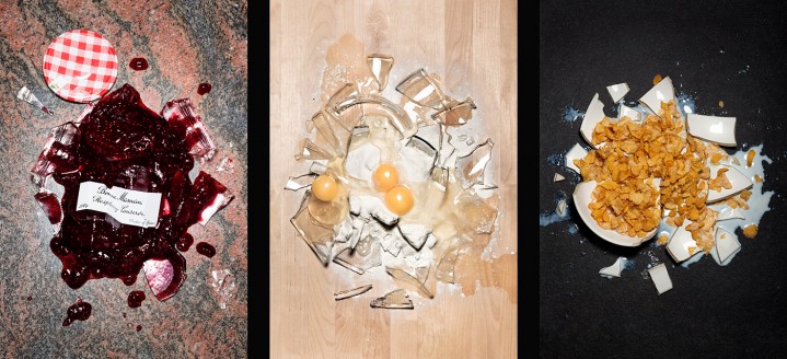
Breakfast disasters

Another in my series of “Three vaguely round things shot from above” (working title, ahem).

This shoot was criminally good fun, and although it was quite a challenge to break things in a visually interesting way, it was nice to be a bit haphazard with the styling to give it an ‘accidental’ feeling.

I wanted the look of the images to be almost forensic, lit like a crime scene. Could work as a coffee promo – I’m apt to do this sort of thing of a morning without a decent amount of caffeine!

And yes, I did eat a bit of the jam with a spoon, carefully avoiding glass shards. No point letting it all go to waste, I say!